While checking my email recently, I noticed my sidebar advertisements are getting more Halloween-ish — mostly, in-terms-of color scheme and a small Halloween-related symbol somewhere in the ad; but Halloween-themed nonetheless! (I also noticed that all-of-these ads direct the viewer to “shop at Walmart;” a fact-which I communicate in this article’s title.)
Seemingly, Halloween brings-out extra campiness among advertisers: The rule-bending ethos of the Halloween season[1] encourages experimentation — such-as costumed housepets — which you won’t-otherwise-see the-rest-of the year. So, I see these cool ads — but how-do-I save them for later enjoyment?
As any connoisseur of online ads will realize, digital advertisements are highly ephemeral: Google doesn’t index dynamically-generated ads; which means you cannot search-for-them on the Internet with any hope-of-success. Your only chance-of-keeping an online advertisement is to make-your-own copy![2]
Because these skyscraper-sized[3] ads were comparatively compelling and whimsically on-par-with each other, I’ve listed these ads alphabetically, by brand name; rather-than work-out-some comparison scale-or-other. The commonalities of these advertisements are:
Attribute 1) The ads appeared within the right-hand sidebar of my Yahoo Mail hosted-email client;
Attribute 2) They appeared as-part-of the big “Halloween ad-rush” that began September 15th, 2021;[4]
Attribute 3) The ads were memorable-enough for me to notice; and
Attribute 4) They remained visible long-enough for me to screenshot a particular ad.[5]
After saving a copy of the original image, I retouched these ads to enhance clarity.[6] (If you’d like-to-know how; then, details are available in my sixth footnote. My purpose was-to-reduce visual artifacts and improve color saturation.)
I will also note-that-when I reference “the Walmart logo,” I’m referring-to the blue, Arial font-face text that says “Walmart” and is immediately followed, to its right, by a “sunburst” of six golden-yellow rays that converge-towards a borderless, white circle. Here’s an example:
Source: https://corporate.walmart.com/photos/walmart-logo
I will also reiterate that-because I couldn’t decide which-ad I felt was “the coolest” or most memorable,[7] I didn’t-bother-ranking these ads. Instead, I’ve listed these advertisements alphabetically, by brand name. Without further preface, here are the ads!

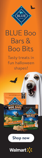
Ad title: “Blue Buffalo: Boo Bars and Boo Bits”[8]
Ad URL: https://crcdn01.adnxs-simple.com/creative/p/7521/2021/9/28/28590367/dc108955-a95c-49db-9313-00a5bef63017.jpg
Description: The diamond-shaped “Blue Buffalo”[9] logo — a dark-blue square, turned 45 degrees, with the word “BLUE” in white, serif text — floats above sans-serif, black text that reads: “BLUE Boo Bars and Bites: Tasty treats in fun Halloween shapes! Shop now [at] Walmart.”
Beneath this text, a large dog wears a ghost sheet — with two eye-holes and a snout-hole — and curves its tongue upwards, along its lips, to indicate satisfaction with the advertised product. (Although the white sheet obscures most-of-the-dog, the dog’s snout has white hair; whereas, pale-brown hair surrounds the dog’s eyes, which are a dark-hazel color.)
In-front-of the ghost-dog, are two pouches of dog treats: To the viewer’s left, are “Boo Bars;” which are cookie-sized biscuits with either a ghost, bat, or pumpkin symbol etched into them. To the viewer’s right, are “Boo Bits;” which are kibble-sized biscuits extruded into the-shape-of a pumpkin, ghost, or mammalian bat. (As-opposed-to a “baseball bat,” which would be-appropriate-for “Baseball Bits!”)[10]
Beneath the dog biscuits, the words “shop now” appear in sans-serif, black text; within a white oval, above the Walmart logo, atop a black inset. Behind-it-all is an orange backdrop — suggesting the color of a pumpkin, but without the ribbed texture — which is punctuated by a few flying bats.

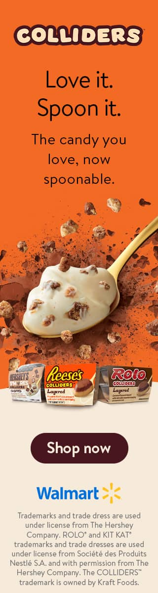
Ad title: “Colliders: Love It, Spoon It”
Ad URL: https://crcdn01.adnxs.com/creative/p/7521/2021/8/17/27689040/3b3b9c84-0c43-4dfd-bb01-e59ae9b8d3be.jpg
Description: After a few-lines-of empty space, the “COLLIDERS”[11] logo appears: It consists of all-capital, sans-serif, pale-yellow letters; trimmed with a thick, brown outline. Complicating this seemingly simple logo, is-that certain letters are angled off-center.
The letter “C,” the second letter “L,” and the letter “R” are skewed slightly upward, by-about five degrees each. (Perhaps, to convey the pseudo-unpredictable flavor combinations that might-result-from mixing one’s favorite candy into a melting-pot!) As a twist, the letter “S” is skewed downward by five degrees — instead-of-upwards; thereby, breaking the pattern and creating visual interest.
Following another-few-lines of empty space, some sans-serif, black text reads: “Love it. Spoon it. The candy you love, [is] now spoonable.” Beneath this message is a large, golden spoon filled-with a white, custard-like substance dotted-with chunks of nougat and nuts. Flakes of chocolate are scattered-about this giant spoon.
Immediately-below the spoon, are miniature cases of candy-flavored pudding. Beneath those cases, are the words “shop now” — in an off-white, sans-serif font within a brown oval — above the Walmart logo. Below the Walmart logo is a paragraph of legalese that reads:
“Trademarks and trade dress are used under license from the Hershey Company. ROLO and KITKAT trademarks and trade dresses are used under license from Société de Produits Nestlé S.A. and with permission from the Hershey Company. The COLLIDERS trademark is owned by Kraft Foods.”
Behind everything is a backdrop, which is orange for the top two-thirds — until halfway-past the cases of pudding — and off-white for the bottom third. The overall aesthetic is an orderly top-third, mostly-consisting-of empty space; an orderly bottom third, dominated by text; and a disorderly middle third, filled-with visual elements at divergent angles that don’t-quite-fit a pattern.

Ad title: “Kit Kat: Have a Boo Break”
Ad URL: https://s0.2mdn.net/11000874/THC_KK_KK_WMHalloweenW2_DISP_NA_JPG_NA_Halloween_160x600_NA_Boo-Break_9.14-10.14.jpg
Description: The “KitKat” logo appears atop the ad. That logo consists-of sans-serif, white letters; trimmed with a thin, black outline and overlying a red oval that is circumscribed by a tapered, pale-yellow oval. The letters “K” are about 50-percent larger than the other letters.
Beneath the “KitKat” logo is sans-serif, white text that reads: “Have a boo break! Have a scream with KitKat bars.” Both to-the-right-of the “KitKat” logo and beneath the white text float solitary, silhouetted bats; presumably, the vampiric variety. Beneath the lower bat, are several KitKat bars that-have-been broken-in-half. Behind the broken bars, is a still-wrapped package of more KitKat bars.
Below the KitKat bars are the words “shop now” in black, sans-serif text overlying a white oval. Beneath this oval is an empty space; presumably, where the Walmart logo seen-in-other ads shown-in-this article should-have-been.[12]
Although the Walmart logo is conspicuously absent, the general layout of the ad suffices-to-imply the store at-which the consumer is directed to “shop now” can-only-be Walmart. (Especially, when the viewer has already seen the other Halloween-themed Walmart ads; such-that one subconsciously associates the words “shop now” — when seen within an oval — to-refer-to Walmart.)
Behind-it-all is a field-of-red, sanguine-in-hue; but nonetheless-resembling the trademark red of the classic KitKat candy wrapper. This color-scheme further supports my theory, that the flying bat is a vampire bat.[13]

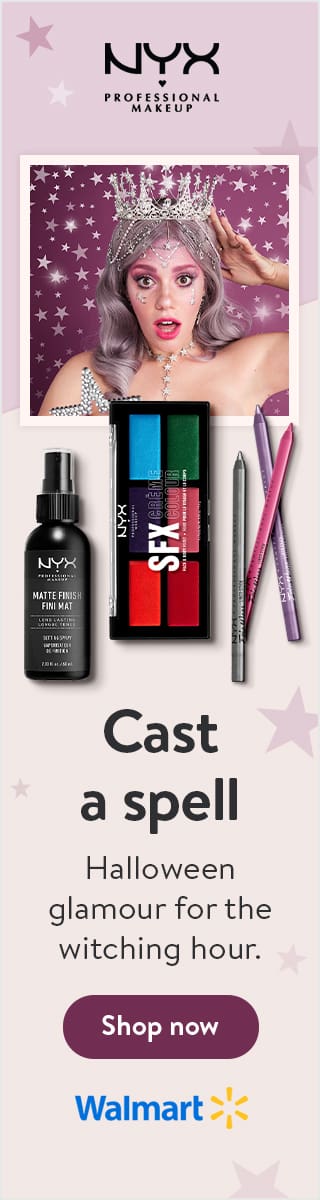
Ad title: “Nyx Professional Makeup: Cast a Spell”
Ad URL: https://crcdn01.adnxs-simple.com/creative/p/7521/2021/9/3/28061217/6f9f69cf-e5f5-4865-b663-5f927095de39.jpg
Description: The “Nyx Cosmetics” logo appears atop the ad; consisting-of black, serif font that’s accentuated-by the tail of the letter “Y” reaching-down-onto another line. Beneath the wordmark, a fairly young, wide-eyed woman gazes at the viewer.
About twenty-some years-in-age, this woman has dark-hazel eyes and shoulder-length hair; which has-been-dyed an ashen, pale purple color. She wears rhinestone-studded accessories, with a star motif. Although her silver tiara suggests the woman is playing a princess, her star-topped wand suggests she’s actually a -fairy- princess.[14]
Immediately below the woman, several makeup products are displayed: a bottle of matte-finish, makeup-setting spray; a 6-panel palette of SFX creme makeup; and three smoky-hued, eye-liner pencils. Further-beneath this, appears sans-serif, black text that reads: “Cast a spell with Halloween glamour[15] for the witching hour! Shop now,” directly above the Walmart logo.
Behind everything is a backdrop, which is roughly divided into a mauve-colored top-third and a beige bottom two-thirds. This backdrop is spangled with seven, five-pointed, lavender stars; arranged at sporadic intervals.

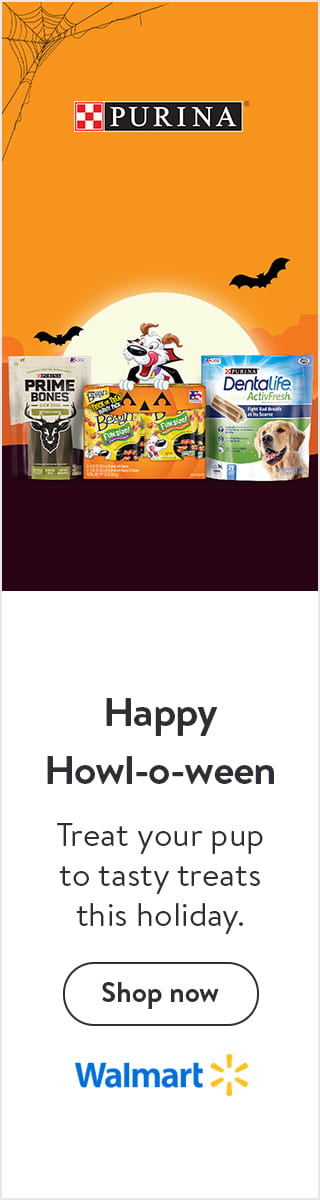
Ad title: “Purina: Howl-o-Ween”
Ad URL: https://crcdn01.adnxs-simple.com/creative/p/7521/2021/9/21/28419798/e35f633f-bbb4-4087-98ad-b426c7dbaf0d.jpg
Description: A small, stringy spider-web spans the upper-left corner. Below-and-right appears the “Purina” logo; which is-made-of a checkered square — consisting-of five red squares interspersed-with four white squares — and all-capital, white, serif letters that spell “PURINA” atop a black rectangle that’s thinly outlined-in-white.
Beneath the “Purina”[16] logo is an-expanse-of orange, empty space; followed-by a pale-yellow full moon that halfway peeks-over a dark-brown horizon. Two bats flank the full moon, one-on-either side. Atop the horizon is a trio of packaged dog treats: deer-flavor Prime Bones, to the left; bacon-flavored Beggin’ Strips, in the middle; and poultry-flavored DentaLife / ActiveFresh dog-chews, to the right.
Looking left, from behind the bag of Beggin’ Strips, is the Purina mascot: a cartoon dog[17] having a large, black nose; mostly white fur; medium-brown, curved ears; and a big, pink tongue curved-upward-in satisfaction. The dog wears a black vampire cape, with a red interior.
Beneath the dog and his treats, lies an expanse that is dark-brown in its upper-half and white in its lower-half. Farther-down is more white, overlaid-with black, sans-serif text that reads: “Happy Howl-o-ween: Treat your pup to tasty treats this holiday.” Below-the-text is sans-serif, black text that reads “shop now” and overlies a white oval, thinly outlined-in-black. Beneath the oval is the Walmart logo.
Behind-it-all is a backdrop, whose top-half is orange and whose bottom-half is white. The dog, bats, spider web, and dog-treats adorn the orange half; whereas, the white half is comparatively sparse, presenting only the call-to-action. The ad’s single-colored empty spaces remind-me-of candy corn.
—Conclusion—
In today’s article, I showcased five Halloween-themed advertisements. Each promoted one-or-more consumer products sold at Walmart; and each advertisement had the “skyscraper” dimensions of 160 x 600 pixels. I even exhaustively described ad verbally, for the-benefit-of-those without graphical input!
If you enjoy this content; then, make-sure-to comment so-that I know you’re feeling this. You might-even-send me links to other advertisements — Halloween-themed or otherwise — that you deem cool. Let me know, and have a great day!
—Footnotes—
[1] For additional insight on the transgressive nature of Halloween, I well-recommend reading David Skal’s “Death Makes a Holiday.” Blending evocative imagery with historical precision, the book can-be-rightly-called “edutainment.”
[2] The two main methods-of-saving ads, which I’ve used, are:
Method 1) Right-click the ad and download it. (Be sure-to-rename the ad, with a more-descriptive filename that allows-you-to-find it later!)
Method 2) Save a screenshot of the ad. (This is necessary, when the “Save image as…” command is-absent-from the right-click context menu.)
[3] “Skyscraper” is the colloquial adjective for digital advertisements having dimensions of 160 pixels wide by 600 pixels tall. Read more about ad sizes, if you’d like!
[4] More specifically, these ads appeared between September 15th and October 8th, 2021: The former date was when I first-saw Halloween ads in the sidebar of my hosted-email client; whereas, the latter date is when I finalized this article. This means there could-be-more ads that appear -after- I post this article; such-that a follow-up piece would be possible!
[5] In all these examples, I also copied the image-hosting URL of the ad; moments before it disappeared! (Although I prefer-it-best among hosted-email clients, Yahoo Mail sometimes overwrites its sidebar ads so quickly; such-that I can barely process the message before another ad takes-its-place. This makes archiving ads especially difficult; because sometimes, the advertisement will disappear before I can make a screenshot and/or copy its image-URL.)
[6] I retouched these ads through a two-step process:
Step 1) I slightly increased the contrast. (In my 1999 edition of Adobe Image Ready, this corresponded-to-raising the “Contrast +5.”)
Step 2) I smoothed-out the most-obvious grainy patches. (In Image Ready, I used the “Gaussian blur” filter with a diffusion of 3-point-7 pixels.)
And I utilize turn-of-the-century software, because it doesn’t require an annual subscription (unlike modern software, which does).
[7] I’m sure this won’t discourage readers from commenting-about-which ads are -their- favorite! If you read this footnote; then, feel free-to-submit a comment for possible publication!
[8] I almost wrote “Boo Bites,” before double-checking the spelling was “Boo Bits.” Although I believe “Boo Bites” would-have-been a more-memorable name, I also understand-why marketers don’t want their dog treats to have the word “bite” in their brand-name: “Neurotic consumers might believe the word ‘bite’ encourages their pet to -bite- people! We can’t have that!! (Neurotic exclamation points, for the win!!!)”
[9] Although I could-not-find where Blue Buffalo is headquartered — as neither their “contact” page nor “frequently asked questions” page divulges this — I did discern General Mills owns Blue Buffalo Pet Products, as-of 2018.
[10] Although “Baseball Bits” isn’t-yet the name of a consumer product, I can claim-myself-as the originator; as-long-as I don’t directly share this suggestion with a company. (In-which-case, their “Terms and Conditions” would state: “Any idea -you- share with us, becomes -our- idea!”
[11] I’m uncertain-why Hershey’s named their candy-flavored pudding “Colliders.” If anything, it’s a misnomer because viscous pudding is slow-moving: Even-when flung, pudding’s impact is minimal. (It’s less-of-a-collision, than a soft landing.) Perhaps, “Hershey’s Pudding” sounded too-generic?
[12] Because there was plenty-of-empty space for the Walmart logo at the customary bottom-of-ad area, I must believe the ad-compositer’s omission of the Walmart logo was entirely a mistake. (As-opposed-to a conscious design choice, to-compensate-for limited space: The ad has plenty-of-spare space!)
[13] Sadly, I’ve yet-to-see a Reese’s peanut-butter cup with fang-marks this season. Perhaps, one-will-appear before-my-next blog post?
[14] I almost wrote “fairy godmother;” however, the model’s young age makes-it-implausible that she’s old-enough to have siblings whose children need a fairy godmother. But a possible counter-point, is-that fairy godmothers don’t necessarily show-their-age. (Commence the fandom arguments!)
[15] The fact-that Nyx advertisements use the British Commonwealth spelling of certain words — such-as “glamour” instead-of “glamor” — indicates Nyx Cosmetics is headquartered in the British Commonwealth. Unfortunately, my Internet searches haven’t uncovered an actual incorporation address for Nyx Cosmetics; and the first result for -most- of my searches, indicates a United States contact center. (Which uses a US-based hotline; as-well-as the American Pacific Standard time-zone, which implies a West Coast location.)
[16] Nestlé owns Purina, just-as-it owns KitKat. Here’s a little-more-about Purina, so-that you can compare-it-with the General Mills-owned Blue Buffalo Pet Products.
[17] Although I couldn’t find confirmation on its official website, Purina’s cartoon dog-mascot resembles a Jack Russell terrier.
